class: middle, right, title-slide # The use of mixed models in lifespan research ## - practical examples in R - ### Athanasia Mowinckel ### Feb. 29th 2020 --- # Mixed models in Lifespan research ## Talk outline .pull-left[ **Practical talk** - Mixed model packages in R - Mixed model formula in R - Running linear mixed models - Running smoothing splines in mixed models ] -- .pull-right[ **Talk goals** - How to specify models - How to inspect models - How to summarise models - How to plot model results - How to compare models ] --- # Mixed models .pull-left[ **Have many names, like anything we love:** - hierarchical models - linear mixed models - linear mixed effects - multi-level models ] .pull-left[ **Can also be extended with** - generalized models - generalized additive models - survival models - Bayesian inference ] ??? In statistics we are usually taught only to do linear regressions, like t-tests and anova. These are good options when you have single observations per entity, and entity can for instance be a person or a location. If you have repeated observations from the same entity, or there is some hierarchical structure to your data in a way, i.e. your dependent obsverations correlate in some way, a linear mixed model might suit your needs more. When searching for information on mixed models, try all these terms, they will give you good coverage of the subject. These terms are not completely synonymous to eachother, but searches on these will help you identify what model applies to your data. --- # Linear mixed models .pull-left[ **Linear models** - Homoscedastic (equal variances) - No autocorrelation (observations are independent) - Resudials should be normally distributed ] .pull-right[ **Linear mixed models** - Handles autocorrelation through _random_ terms - Handles heteroscedasticity through _random_ terms - Residuals need not be normally distributed - When _linear model_ assumptions are met, generally gives same results in large data sets ] --- # Mixed model packages in R .pull-left[ ### Linear ```r # First available package for LMMs library(nlme) # Newer package, somewhat different syntax library(lme4) ``` ] .pull-right[ ### Splines ```r # Based on {nlme} runs smoothing splines library(mgcv) # Based on lme4, runs smoothing splines library(gamm4) ``` ] ### Bayesian ```r library(rstanarm) # Based on lme4/gamm4, runs models in Stan MCMC library(brms) # Based on lme4/gamm4, runs models in Stan MCMC ``` ??? I do not have experience with all these packages, and I'm sure there are more that I do not know of. But from all I have read and all tutorials I have done, papers I have worked on, these are the main pacakges people use in R for running mixed models. --- class: inverse, center # Getting started <div style="align: center"> <h1> - inspecting the data - </h1> </div> ??? First thing we should do is have a proper look at the data, and get an idea of what we are working with. Looking at the structure and relationships in the data helps us formulate a model that is appropriate. --- # Getting started .pull-left[ ```r library(tidyverse) # Create a directory to place data in dir.create("data") # Download the data and place it in the data folder download.file(url = "shorturl.at/ehKL0", destfile = "data/sim_data.rda") # Load in the data to R load("data/sim_data.rda") ``` ] .pull-right[ ```r ggplot(sim_data, aes(x=Age, y=Hippocampus, group=ID)) + geom_point() + geom_line() ``` 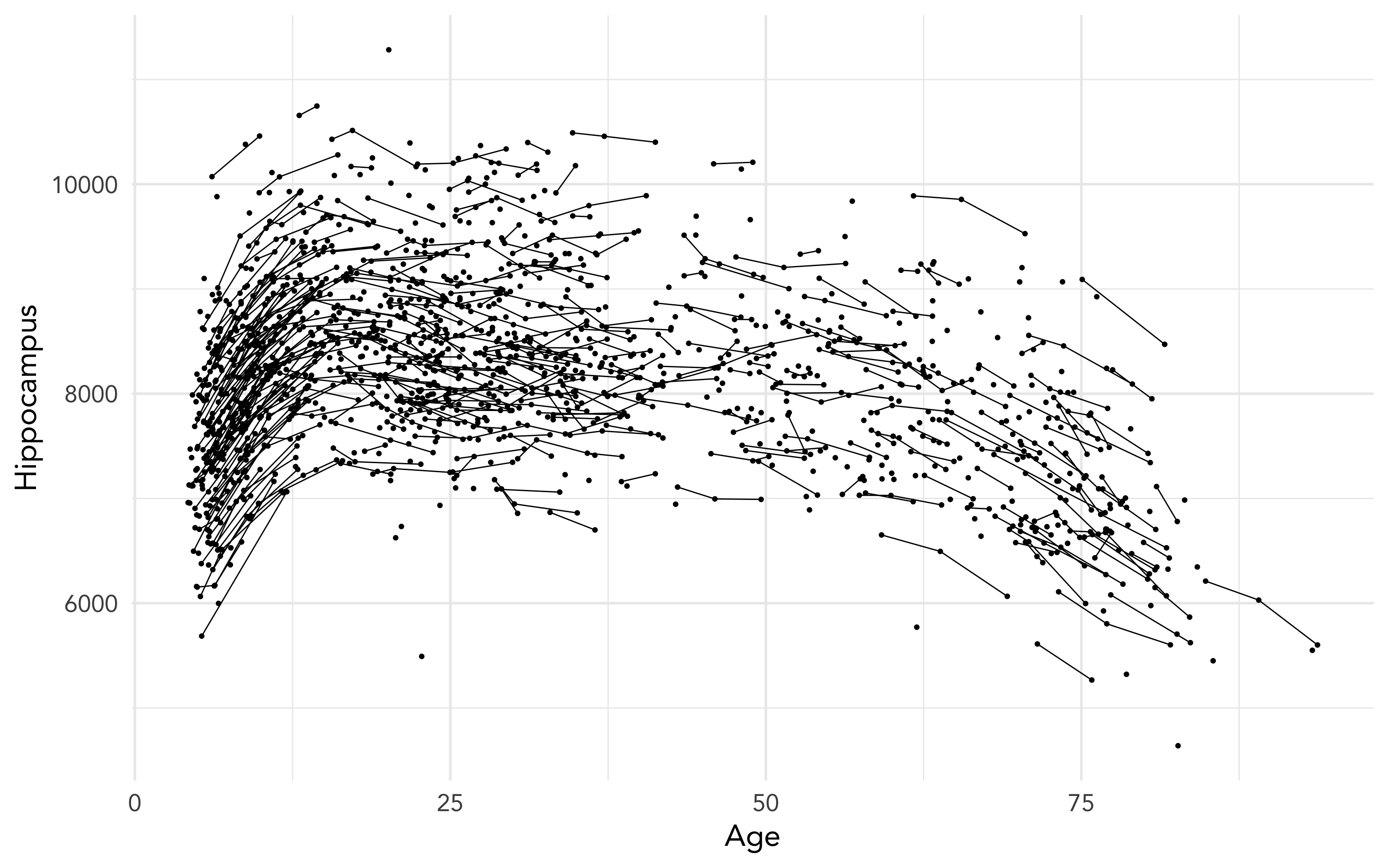<!-- --> ] ??? We will be using the dataset I used in my previous talk to highlight some aspects of mixed models and why use them in lifespan research. --- # Getting started - data types .pull-left[ ### Long data ``` ## # A tibble: 8 x 4 ## ID Time Hippocampus Matrix ## <fct> <int> <dbl> <dbl> ## 1 1 1 6566. 24.5 ## 2 2 1 8081. 22.0 ## 3 3 1 8209. 28.5 ## 4 3 2 8181. 25.4 ## 5 3 3 8123. 24.3 ## 6 4 1 8075. 26.8 ## 7 5 1 6732. 26.2 ## 8 6 1 9067. 21.0 ``` ] .pull-right[ ### Wide data ``` ## # A tibble: 6 x 7 ## ID Hippocampus_1 Hippocampus_2 Hippocampus_3 Matrix_1 Matrix_2 Matrix_3 ## <fct> <dbl> <dbl> <dbl> <dbl> <dbl> <dbl> ## 1 1 6566. NA NA 24.5 NA NA ## 2 2 8081. NA NA 22.0 NA NA ## 3 3 8209. 8181. 8123. 28.5 25.4 24.3 ## 4 4 8075. NA NA 26.8 NA NA ## 5 5 6732. NA NA 26.2 NA NA ## 6 6 9067. NA NA 21.0 NA NA ``` ] ??? Its quite common in psychology, at least, that data is entered in the wide format. Commonly used programs, like SPSS, need this type of data structure for data analysis. But when doing mixed models, in any program, data need to be long. The long data format makes it possible to inform the model of change over time, and the obserations that depend on eachother. The long format lets us inform the model about the hierarchy the data has. --- # Inspecting the data ### checking the distribution of the data .pull-left[ ```r sim_data %>% ggplot(aes(x=Hippocampus)) + geom_density(alpha=.5) ``` ] .pull-right[ <img src="practical-talk_files/figure-html/dist1-out-1.png" width="100%" /> ] ??? While we need not have the residuals of the models be normally distributed in mixed models, the distribution of the data tells us what type of model is apporpriate to run. By switching to generalized models, we can choose the distributions that fit, so we can create better models. Binomial data need binomial distributions Ordinal data need logit's etc. --- ## Inspecting the data .pull-left[ ```r sim_data %>% ggplot(aes(x=Age, y=Hippocampus)) + geom_jitter(alpha=.2) + geom_smooth(method = "lm", colour="black") ``` - The `geom_smooth` of ggplot can give us a simple linear regression over the data. - It looks like there is an association between hippocampus volume and age. ] .pull-right[ 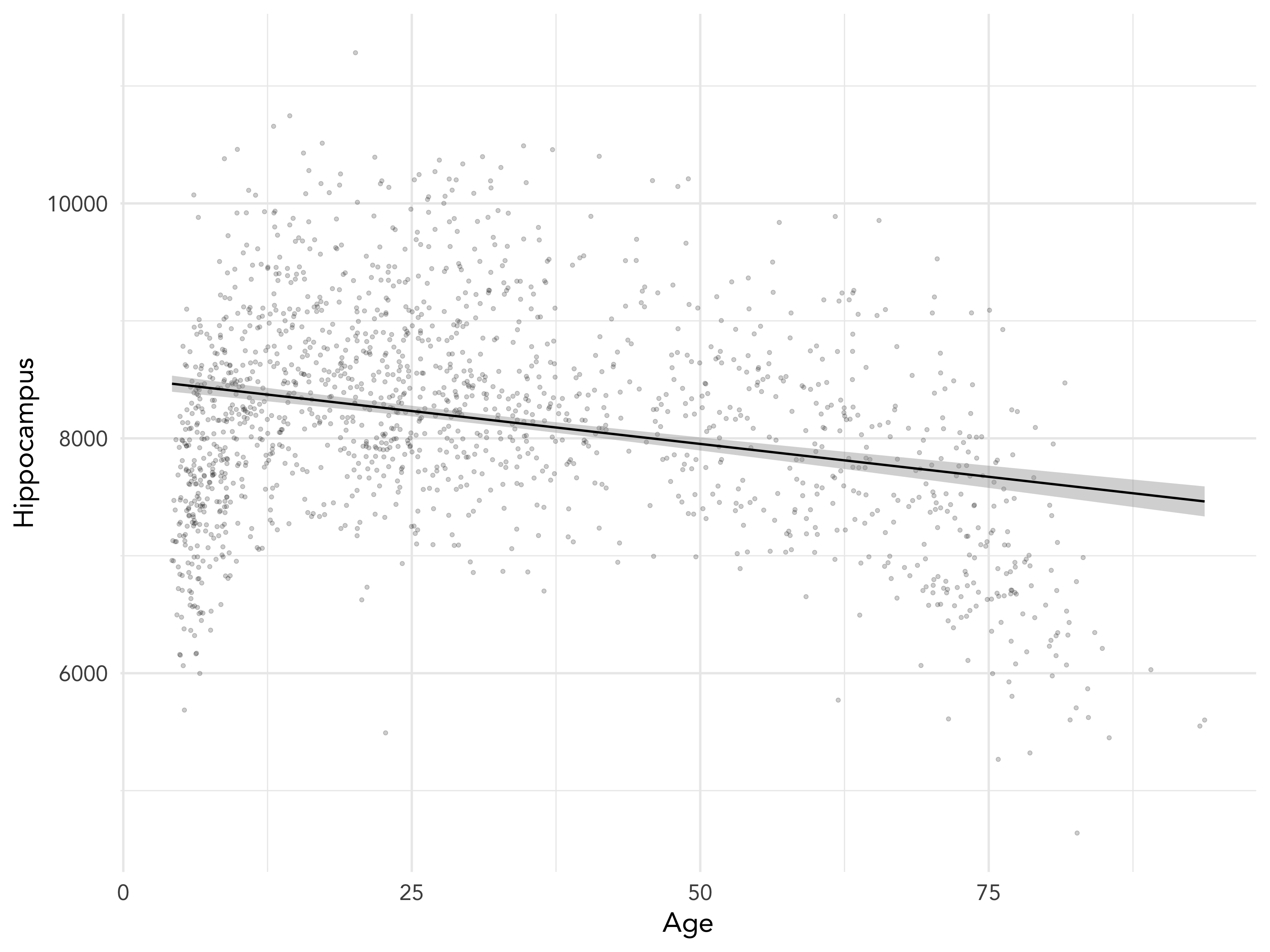<!-- --> ] --- class: inverse, center # Let's do some modelling! <div style="align: center"> <h1> - exploring standard linear models - </h1> </div> --- # Some R-syntax information - formula .pull-left[ To predict hippocampus volume by age: `Hippocampus ~ Age` Main effects are added on using `+`. To predicting hippocampus volume by age and sex between observations as main effects. `Hippocampus ~ Age + Sex` ] .pull-right[ Interactions are specified with `:`. To predicting hippocampus volume by the interaction between age and sex alone. `Hippocampus ~ Age:Sex` A 'full factorial', a complete mains + interactions can be done as such: `Hippocampus ~ Age + Sex + Age:Sex` or the shorthand with an asterisk (`*`) `Hippocampus ~ Age * Sex ` ] ??? Running models in R, we use something we call a `formula`. This is basically an unquoted expression of your model specification. --- # Linear models - running a simple model .pull-left[ ```r # Helps us tidy up model outputs library(broom) # Run standard linear model sim_data_lm <- lm( Hippocampus ~ Age, data = sim_data ) ``` ```r # Tidy model output into a table tidy(sim_data_lm) ``` ] .pull-right[ <table> <caption>Results from linear model predicting hippocampus volume by age</caption> <thead> <tr> <th style="text-align:left;"> term </th> <th style="text-align:right;"> estimate </th> <th style="text-align:right;"> std.error </th> <th style="text-align:right;"> statistic </th> <th style="text-align:right;"> p.value </th> </tr> </thead> <tbody> <tr> <td style="text-align:left;"> (Intercept) </td> <td style="text-align:right;"> 8512.208 </td> <td style="text-align:right;"> 38.2634 </td> <td style="text-align:right;"> 222.4635 </td> <td style="text-align:right;"> 0 </td> </tr> <tr> <td style="text-align:left;"> Age </td> <td style="text-align:right;"> -11.200 </td> <td style="text-align:right;"> 0.9877 </td> <td style="text-align:right;"> -11.3393 </td> <td style="text-align:right;"> 0 </td> </tr> </tbody> </table> ] --- # Linear models - checking assumption violations .left-column[ ```r plot(sim_data_lm, which=1) ``` ] .right-column[ 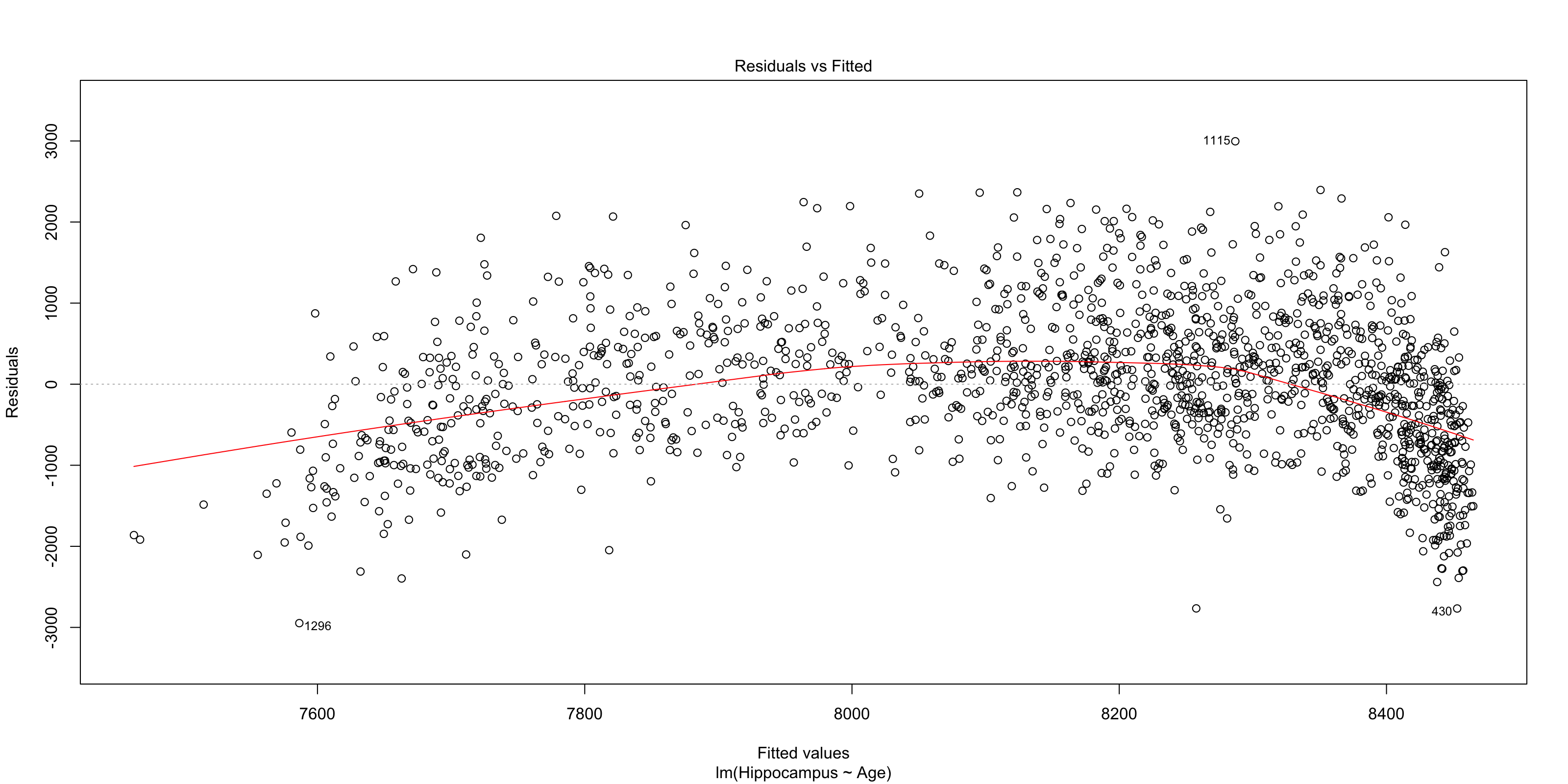<!-- --> ] ??? Simple regressions in R have very easy ways to plot and check for assumption violations, just by plotting the model output. This residuals plot clearly shows that the assumption that the residuals be normally distributed is violated. If they were, the red line would be straight from 0, and the dots would appear to be random around the plot. --- # Linear models - checking assumption violations .left-column[ ```r plot(sim_data_lm, which=2) ``` ] .right-column[ 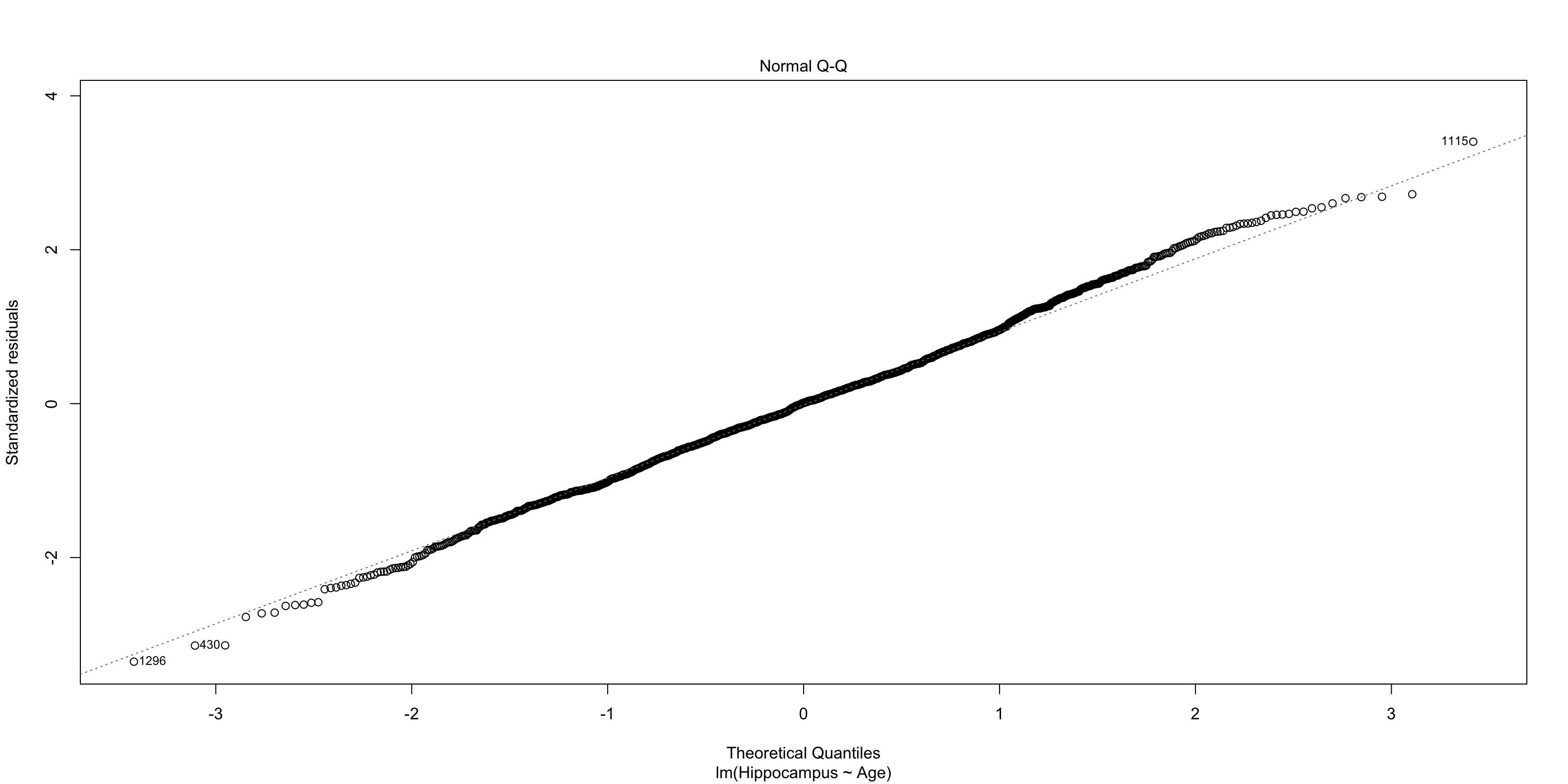<!-- --> ] ??? The normal QQ-plot is another great way to check violations. The dots should fall along the line should as a straight diagonal from corner to corner. This line is not corner-to-corner, and the dots don't all fall along it. This means there is something important in the data we are not accounting for. --- class: dark, middle, center # Let's do some modelling! ## Exploring linear mixed models --- # Linear mixed models ```r library(lme4) sim_data_lme <- lmer(Hippocampus ~ Age + (1|ID), data = sim_data) ``` ```r tidy(sim_data_lme) ``` <table> <thead> <tr> <th style="text-align:left;"> term </th> <th style="text-align:right;"> estimate </th> <th style="text-align:right;"> std.error </th> <th style="text-align:right;"> statistic </th> <th style="text-align:left;"> group </th> </tr> </thead> <tbody> <tr> <td style="text-align:left;"> (Intercept) </td> <td style="text-align:right;"> 8368.7379 </td> <td style="text-align:right;"> 46.2345 </td> <td style="text-align:right;"> 181.0065 </td> <td style="text-align:left;"> fixed </td> </tr> <tr> <td style="text-align:left;"> Age </td> <td style="text-align:right;"> -6.8942 </td> <td style="text-align:right;"> 1.1616 </td> <td style="text-align:right;"> -5.9351 </td> <td style="text-align:left;"> fixed </td> </tr> <tr> <td style="text-align:left;"> sd_(Intercept).ID </td> <td style="text-align:right;"> 847.8452 </td> <td style="text-align:right;"> NA </td> <td style="text-align:right;"> NA </td> <td style="text-align:left;"> ID </td> </tr> <tr> <td style="text-align:left;"> sd_Observation.Residual </td> <td style="text-align:right;"> 275.4828 </td> <td style="text-align:right;"> NA </td> <td style="text-align:right;"> NA </td> <td style="text-align:left;"> Residual </td> </tr> </tbody> </table> ??? In the package `lme4` a random effect (autororrelation specification) is added with the formulaeic expression `(1|entity)`, which will fit an independent intercept per entity. In this case, our entity is mountain range. You may also use the package `nlme` for linear mixed models, but you specify the random effect differently. --- # Linear mixed models - inspecting residuals .left-column[ ```r lme_resid <- resid( sim_data_lme ) qqnorm(lme_resid) qqline(lme_resid) ``` ] .right-column[ <!-- --> ] ??? With LMEs we no longer get QQ plots to inspect, so we need to force one with some extra coding. And this QQ looks even worse! why? There is something in the data we are not accounting for. Let's look at the original data again and see what it can be --- # Linear mixed models <img src="practical-talk_files/figure-html/unnamed-chunk-13-1.png" style="display: block; margin: auto;" /> ??? We are trying to fit a linear model, on data that is quite clearly not linear. This standard generalized additive model clearly shows us that a splining function will be much better suited to this data. It follows the trajectories much much better. We can thankfully do generalized additive mixed models, so that suits are needs! --- # Generalized Additive Mixed Models .pull-left[ ```r library(mgcv) sim_data_gamm <- gamm( Hippocampus ~ s(Age), random = list(ID = ~1), data = sim_data) ``` ```r tidy(sim_data_gamm$gam) ``` <table> <thead> <tr> <th style="text-align:left;"> term </th> <th style="text-align:right;"> edf </th> <th style="text-align:right;"> ref.df </th> <th style="text-align:right;"> statistic </th> <th style="text-align:right;"> p.value </th> </tr> </thead> <tbody> <tr> <td style="text-align:left;"> s(Age) </td> <td style="text-align:right;"> 8.9082 </td> <td style="text-align:right;"> 8.9082 </td> <td style="text-align:right;"> 552.249 </td> <td style="text-align:right;"> 0 </td> </tr> </tbody> </table> ] .pull-right[ <!-- --> ] ??? results from smoothing splines have far far trickier results to interpret, in a table that is, than linear models. That is because there is no true way to properly explain in numbers how the spline looks, so in general, we interpret the estimated degrees of freedom, telling something about how much degrees of freedom the model needs to do it's estimations, and the p-values to say something about the likelihood of the results showing something true. Then we use plots to interpret what the results really mean. --- # GAMM - plotting results .left-column[ ```r plot( sim_data_gamm$gam ) ``` ] .right-column[ <img src="practical-talk_files/figure-html/resid-gamm-1-out-1.png" width="100%" /> ] ??? The standard plot of a gamm-model object looks like this. It's a simple drawing of the spline, it's confidence intervals, and the rug below shows where on the X-axis datapoints land in the original data. I find this plot a little unsatisfying, so I always re-create them, using ggplot, and having the spaghetti plots in the background. --- # GAMM - plotting results .pull-left[ ```r # Create a data frame with 1000 rows, # and Age distributed from 0 to 110 pred_data <- tibble( Age = seq(0, 110, length.out = 200) ) # Predict data using the pred_data, # getting both fit and standard error fit_data <- as_tibble( predict(sim_data_gamm$gam, newdata = pred_data, se.fit = TRUE) ) # Combine the two pred_data <- bind_cols(pred_data, fit_data) ggplot(pred_data, aes(x=Age, y=fit)) + geom_line() ``` ] .pull-right[ <img src="practical-talk_files/figure-html/gamm-gg-out-1.png" width="100%" /> ] ??? Plotting gamms require some work, as you need to find the values along X you want to predict, but the nice part is that you can also extend the prediction beyond your own data. Truly predicting what your model thinks data outside your sampling range looks like. --- # GAMM - plotting results .pull-left[ ```r sim_data %>% ggplot(aes(x=Age)) + geom_point(alpha=.3, aes(y=Hippocampus)) + geom_line(alpha=.3, aes(y=Hippocampus, group=ID)) + geom_ribbon(data = pred_data, alpha = .4, fill = "forestgreen", aes(ymin = fit-se.fit, ymax = fit+se.fit)) + geom_line(data = pred_data, colour = "forestgreen", aes(y = fit)) ``` ] .pull-right[ <img src="practical-talk_files/figure-html/gamm-gg-2-out-1.png" width="100%" /> ] ??? Now that we have the base fit data, we can build the plot. --- # Generalized Additive Mixed Models .pull-left[ ```r sim_data_gamm2 <- gamm( Hippocampus ~ s(Age) + s(Age, by = Matrix), random = list(ID = ~1), data = sim_data) ``` ```r tidy(sim_data_gamm2$gam) ``` <table> <thead> <tr> <th style="text-align:left;"> term </th> <th style="text-align:right;"> edf </th> <th style="text-align:right;"> ref.df </th> <th style="text-align:right;"> statistic </th> <th style="text-align:right;"> p.value </th> </tr> </thead> <tbody> <tr> <td style="text-align:left;"> s(Age) </td> <td style="text-align:right;"> 8.9083 </td> <td style="text-align:right;"> 8.9083 </td> <td style="text-align:right;"> 544.7876 </td> <td style="text-align:right;"> 0.0000 </td> </tr> <tr> <td style="text-align:left;"> s(Age):Matrix </td> <td style="text-align:right;"> 2.0000 </td> <td style="text-align:right;"> 2.0000 </td> <td style="text-align:right;"> 0.2313 </td> <td style="text-align:right;"> 0.7936 </td> </tr> </tbody> </table> ] .pull-right[ <!-- --> ] --- # Generalized Additive Mixed Models ```r plot(sim_data_gamm2$gam) ``` <img src="practical-talk_files/figure-html/unnamed-chunk-22-1.png" width="50%" /><img src="practical-talk_files/figure-html/unnamed-chunk-22-2.png" width="50%" /> ??? Now that we have two smooth terms, we also have two plots! But what the heck is up with that second plot, nothing? No, there is something there, but by default the plots are returned with the same scale on the y-axis, and so the interaction term looks completely flat. --- # Generalized Additive Mixed Models .pull-left[ ```r plot( sim_data_gamm2$gam, select = 2, ylim = c(-30, 30)) ``` ] .pull-right[ <img src="practical-talk_files/figure-html/gamm-gg-m-out-1.png" width="100%" /> ] --- # GAMMs - plotting results .pull-left[ ```r # Create a data frame with 1000 rows, # and Age distributed from 0 to 110 pred_data <- tibble( Age = seq(0, 110, length.out = 200), Matrix = 0 ) # Predict data using the pred_data, # getting both fit and standard error fit_data <- as_tibble( predict(sim_data_gamm2$gam, newdata = pred_data, se.fit = TRUE) ) # Combine the two pred_data <- bind_cols(pred_data, fit_data) ggplot(pred_data, aes(x=Age, y=fit)) + geom_ribbon(aes(ymin = fit - se.fit, ymax = fit + se.fit), alpha=.4) + geom_line(size=1.5) ``` ] .pull-right[ <img src="practical-talk_files/figure-html/gamm-gg-3-out-1.png" width="100%" /> ] --- # GAMMs - plotting results .pull-left[ ```r # expand grid combines all elements # so all combinations are created sim_data_gamm2_pred <- expand_grid( Age = seq(0, 110, length.out = 200), Matrix = seq(0, 40, by = 1) ) %>% bind_cols(as_tibble( predict(sim_data_gamm2$gam, newdata = ., se.fit = TRUE) )) ggplot(sim_data_gamm2_pred, aes(x=Age, y=fit, colour=Matrix, group=Matrix)) + geom_line(size=1.5) ``` ] .pull-right[ <img src="practical-talk_files/figure-html/gamm-gg-4-out-1.png" width="100%" /> ] --- # GAMMs - plotting results .pull-left[ ```r sim_data_gamm2_predmat <- expand_grid( Age = seq(0, 110, length.out = 200), Matrix = seq(0, 40, by = .1) ) %>% bind_cols(as_tibble( predict(sim_data_gamm2$gam, newdata = ., terms = "s(Age):Matrix", se.fit = TRUE) )) sim_data_gamm2_predmat %>% ggplot(aes(x = Age, y = fit, colour = Matrix, group = Matrix)) + geom_line() ``` ] .pull-right[ <img src="practical-talk_files/figure-html/gamm-gg-6-out-1.png" width="100%" /> ] --- # Mixed models - comparing models ??? R tells us that the models are refitted with ML instead of REML. This is necessary for model comparison, and it's very handy that this is done for us, so we don't have to keep running models in parallell for comparisons. You can now also see that the two models with the different ways of nesting have identical values, and give the same output. So now we know that. The next question is, how do we know that any of these models are better than the null, i.e. that there is no relationship between body length and intelligence? We should run a "null" model, and add this to the models comparisons table. **TASK:** Run the "null" model, check the QQ-plot, and add it to the model comparisons. **HINT:** Formula to just calculate the intercept for a model (the null) is `y ~ 1 + (1|entity)` --- # Mixed models - comparing models .pull-left[ ```r sim_data_lme_null <- lmer(Hippocampus ~ 1 + (1|ID), data=sim_data) ``` <table> <thead> <tr> <th style="text-align:left;"> term </th> <th style="text-align:right;"> estimate </th> <th style="text-align:right;"> std.error </th> <th style="text-align:right;"> statistic </th> <th style="text-align:left;"> group </th> </tr> </thead> <tbody> <tr> <td style="text-align:left;"> (Intercept) </td> <td style="text-align:right;"> 8149.7 </td> <td style="text-align:right;"> 28.7 </td> <td style="text-align:right;"> 283.5 </td> <td style="text-align:left;"> fixed </td> </tr> <tr> <td style="text-align:left;"> sd_(Intercept).ID </td> <td style="text-align:right;"> 878.7 </td> <td style="text-align:right;"> NA </td> <td style="text-align:right;"> NA </td> <td style="text-align:left;"> ID </td> </tr> <tr> <td style="text-align:left;"> sd_Observation.Residual </td> <td style="text-align:right;"> 268.2 </td> <td style="text-align:right;"> NA </td> <td style="text-align:right;"> NA </td> <td style="text-align:left;"> Residual </td> </tr> </tbody> </table> ] .pull-right[ ```r sim_data_gamm_null <- gamm(Hippocampus ~ 1, random = list(ID = ~ 1), data=sim_data) ``` <table> <thead> <tr> <th style="text-align:left;"> term </th> <th style="text-align:right;"> estimate </th> <th style="text-align:right;"> std.error </th> <th style="text-align:right;"> statistic </th> <th style="text-align:right;"> p.value </th> </tr> </thead> <tbody> <tr> <td style="text-align:left;"> (Intercept) </td> <td style="text-align:right;"> 8149.7 </td> <td style="text-align:right;"> 28.7 </td> <td style="text-align:right;"> 283.5 </td> <td style="text-align:right;"> 0 </td> </tr> </tbody> </table> ] --- # Mixed models - comparing models ```r anova( sim_data_gamm_null$lme, sim_data_gamm$lme, sim_data_gamm2$lme ) ``` <table> <thead> <tr> <th style="text-align:right;"> Model </th> <th style="text-align:right;"> df </th> <th style="text-align:right;"> AIC </th> <th style="text-align:right;"> BIC </th> <th style="text-align:right;"> logLik </th> <th style="text-align:left;"> Test </th> <th style="text-align:right;"> L.Ratio </th> <th style="text-align:right;"> p-value </th> <th style="text-align:left;"> formula </th> </tr> </thead> <tbody> <tr> <td style="text-align:right;"> 1 </td> <td style="text-align:right;"> 3 </td> <td style="text-align:right;"> 25013.21 </td> <td style="text-align:right;"> 25029.32 </td> <td style="text-align:right;"> -12503.61 </td> <td style="text-align:left;"> </td> <td style="text-align:right;"> NA </td> <td style="text-align:right;"> NA </td> <td style="text-align:left;"> Hippocampus ~ 1 </td> </tr> <tr> <td style="text-align:right;"> 2 </td> <td style="text-align:right;"> 5 </td> <td style="text-align:right;"> 23434.56 </td> <td style="text-align:right;"> 23461.40 </td> <td style="text-align:right;"> -11712.28 </td> <td style="text-align:left;"> 1 vs 2 </td> <td style="text-align:right;"> 1582.652562 </td> <td style="text-align:right;"> 0.0000000 </td> <td style="text-align:left;"> Hippocampus ~ s(Age) </td> </tr> <tr> <td style="text-align:right;"> 3 </td> <td style="text-align:right;"> 8 </td> <td style="text-align:right;"> 23440.10 </td> <td style="text-align:right;"> 23483.04 </td> <td style="text-align:right;"> -11712.05 </td> <td style="text-align:left;"> 2 vs 3 </td> <td style="text-align:right;"> 0.462294 </td> <td style="text-align:right;"> 0.9270936 </td> <td style="text-align:left;"> Hippocampus ~ s(Age) + s(Age, by = Matrix) </td> </tr> </tbody> </table> --- # Mixed models - comparing models .pull-left[ ```r ggplot(sim_data, aes(x=Age)) + geom_jitter(alpha=.2, aes( y=Hippocampus)) + geom_ribbon(data=fits,alpha=.4, aes(ymin=fit - se.fit, ymax=fit + se.fit, fill=model)) + geom_line(data=fits, aes(y=fit, colour=model)) ``` ] .pull-right[ <!-- --> ] ??? Lets have a look at our fit. Make a data.frame with the variable of interest, `Age`, spanning the time to predict in and run a prediction to get the fits. We also add a standard linear smooth and see if that is different. --- # Mixed models - our best model <img src="practical-talk_files/figure-html/unnamed-chunk-29-1.png" width="50%" /><img src="practical-talk_files/figure-html/unnamed-chunk-29-2.png" width="50%" /> --- class: center # More resources on mixed models and GAM Julia Pilowski's [practical guide](https://www.juliapilowsky.com/2018/10/19/a-practical-guide-to-mixed-models-in-r/) Julie Silge's [modelling of salaries](https://juliasilge.com/blog/salary-gender/) Bodo Winters' [tutorials and data](http://www.bodowinter.com/tutorials.html) Page Paccini's [lme R-course](https://pagepiccinini.com/r-course/lesson-6-part-1-linear-mixed-effects-models/) Jared Knowles' [getting started](https://www.jaredknowles.com/journal/2013/11/25/getting-started-with-mixed-effect-models-in-r) B. Bolker's [mixed models in R](https://rpubs.com/bbolker/3336) Gabriela Hadjuk's [introduction](https://gkhajduk.github.io/2017-03-09-mixed-models/) Noam Ross' [GAMs in R](https://noamross.github.io/gams-in-r-course/) --- class: center # Shameless self-promotion <iframe src="https://drmowinckels.io" width="80%" height="415px"></iframe> [https://drmowinckels.io](https://drmowinckels.io)