New {ggseg} with Geom!
We released a new version of the ggseg R-package for visualizing brain atlases. It features a geom_brain function and position_brain for flexible brain slice positioning in ggplot2. This update enhances atlas plotting, offering more customization and improved visuals.
A couple of months ago, we released a new version of our ggseg R-package for visualisations of brain atlases. I had been wanting to create such an update for a long time, but getting the internal logics of a ggplot geom working as I wanted was rather difficult. Likely because I was trying to do too many things, but, hey… that’s me!
One of the main things I wanted to get rid of, was this need to first group your data before sending it to ggplot if you want to facet. This rather unintuitive thing was really messing me and my users up. I had a hope that making a geom would be better. Also, a geom could be more familiar to ggplot users, and also likely harness the power that is ggplot better.
After many a long hours trying to figur this out, and some informal chats with Thomas Lin Pedersen, I realised that my wish might not come true. I’m still hoping and toying with an idea, but unsure if it will ever come to fruition as I’d like.
But I did get a geom working, and even a position! The geom it self I’m quite happy with, despite it still missing some features I’m rather keen on. But the position is what I’m truly happy about! Before, it was rather cumbersome to re-position the brain slices as you’d like to.
Let’s have a look at it.
library(ggplot2)
library(ggseg)

ggseg(atlas = dk,
      mapping = aes(fill = region),
      show.legend = FALSE,
      color = "black",
      position = "dispersed")
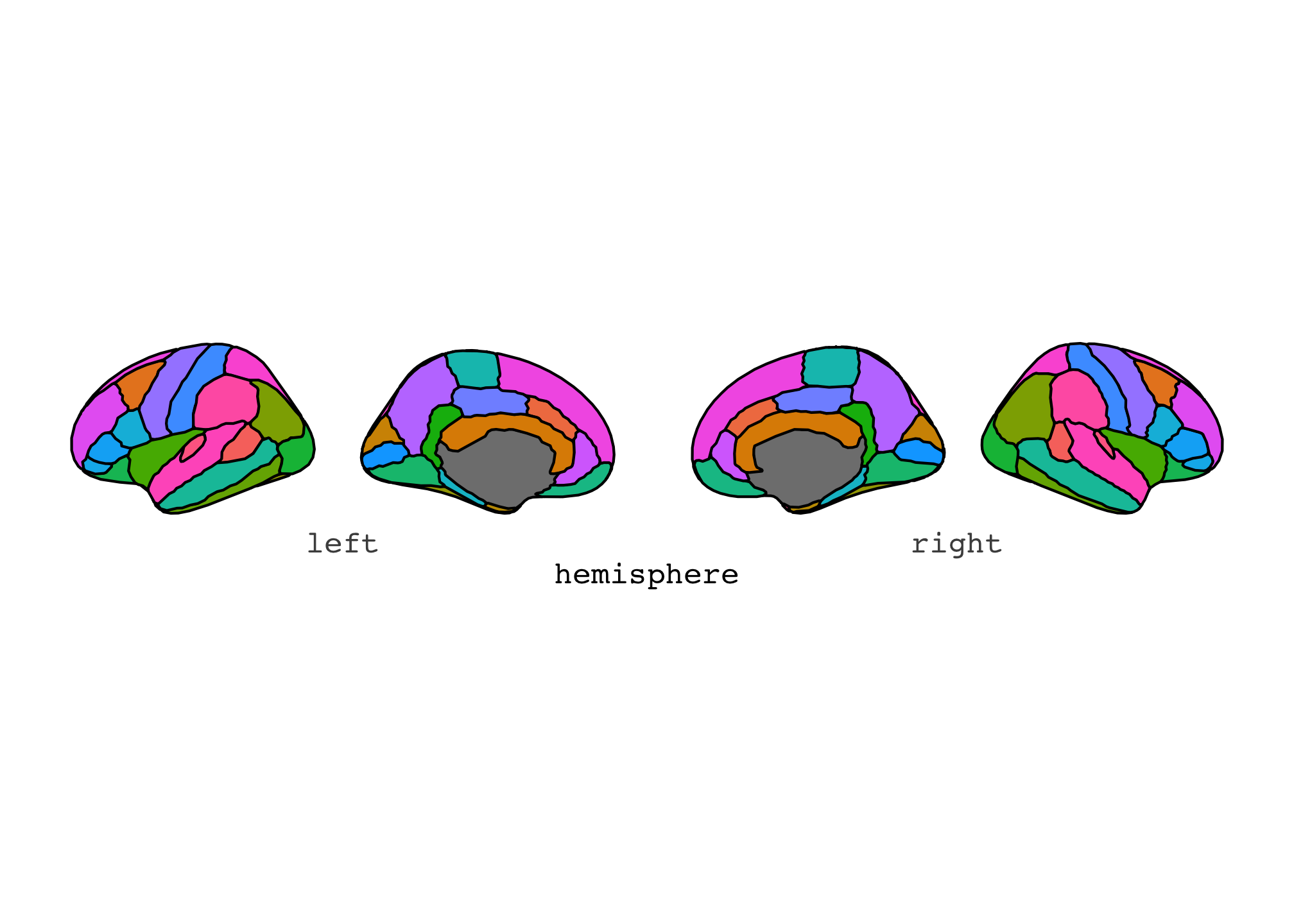
“dispersed” is the default position of any brain atlas we have for ggseg. Where the brain slices are ordered neatly in a single row.
This can be changes to a grid by using the “stacked” position.
ggseg(atlas = dk,
      mapping = aes(fill = region),
      show.legend = FALSE,
      color = "black",
      position = "stacked")
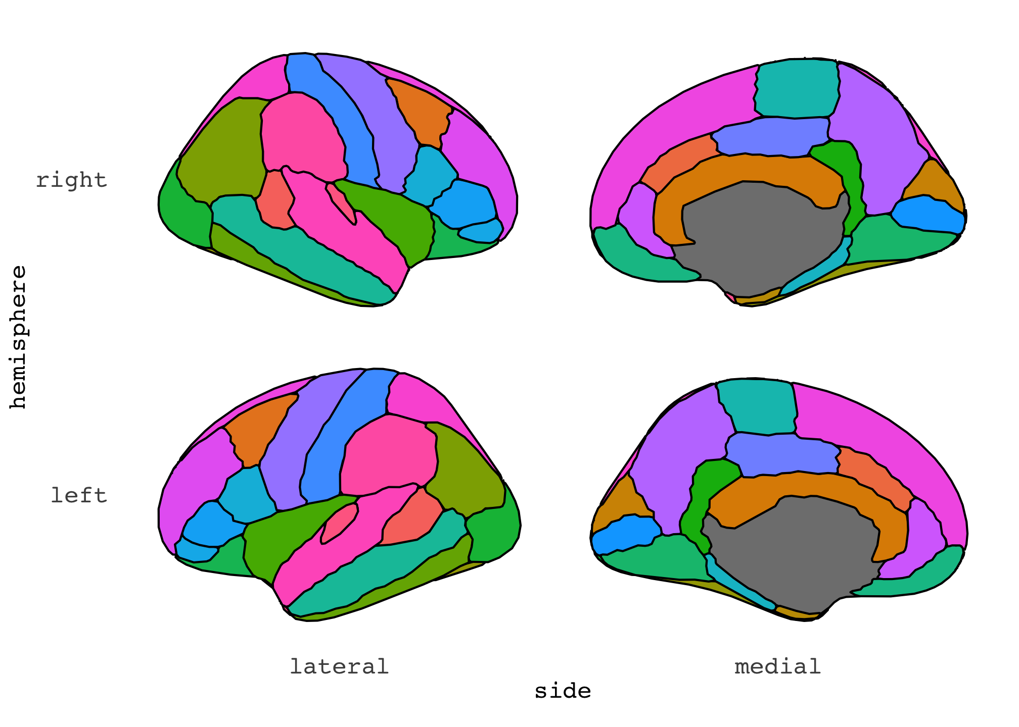
Any other re-ordering of slice positions just don’t work, because the internal logic of doing that is just not there. And it’s too much to get it in there.
But in the geom, we have more flexibility because of the position!
When using the geom, the syntax is quite different from ggseg() but more close to other ggplots.
ggplot() +
  geom_brain(atlas = dk, show.legend = FALSE)
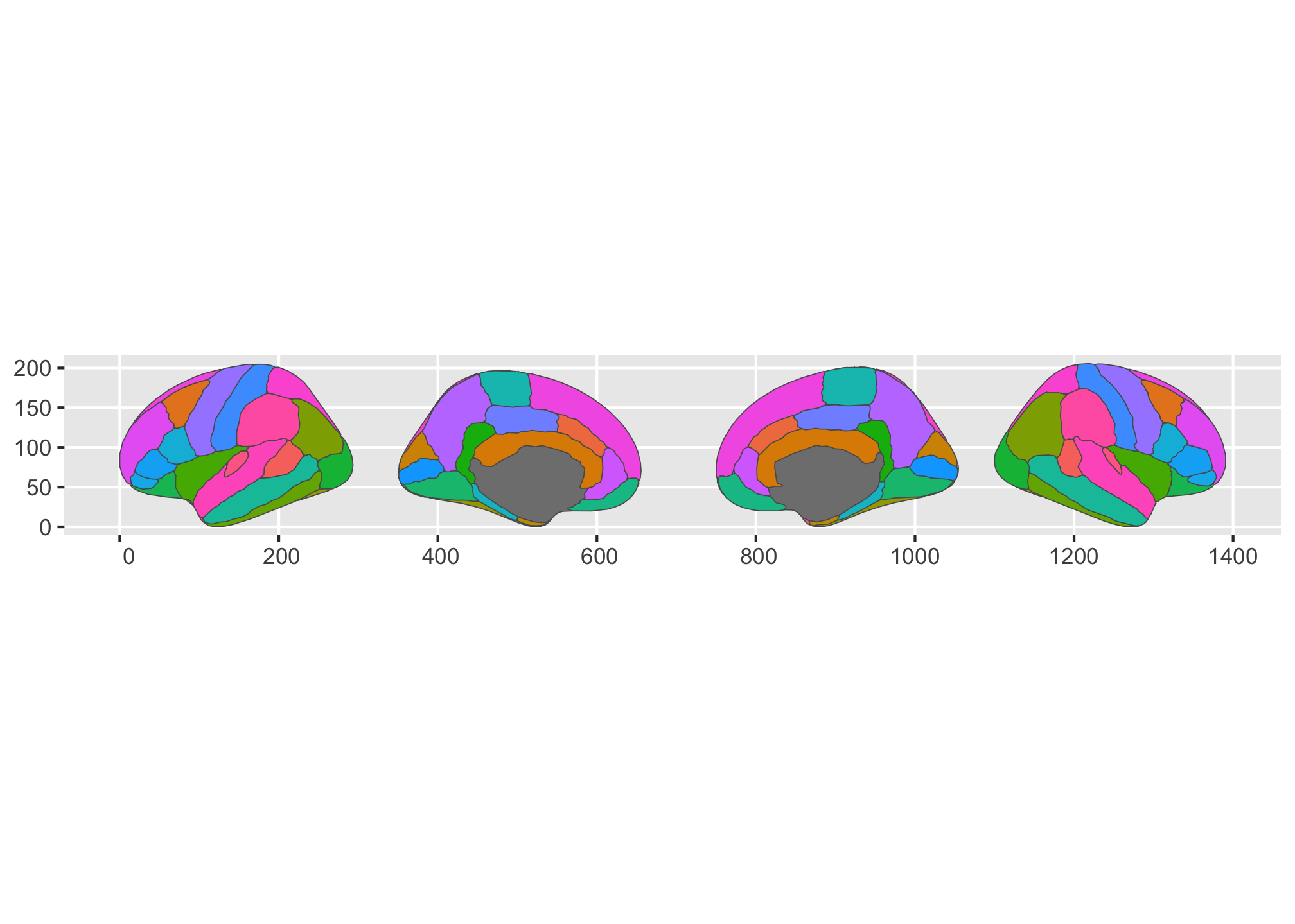
We can see here that there are several things that have changed.
For instance, I did not specify the fill colour by regions, but it happened automatically!
This is a thing I got for free basically, because geom_brain is built on geom_sf which also does this.
This is kind of what most users would expect as default behaviour, when just plotting the atlas.
The colour of the edges around the regions is also more delicate and the entire plot actually looks more high-def and sleek.
Again, we’re getting the for free from the sf geom.
The downside to the geom is that I’ve now lost the ability to automatically alter the axis and grid lines based on the hemisphere and side, so the axes now dont contain any informative information.
I’ve again had a chat with both Thomas Lin Pedersen and Claus Wilke about what I was after and it was not within scope.
I’ll likely add som convenience functions to help users along for this, but its just not there right now, and won’t ever be in the automatic way as in ggseg().
Now, let’s get to the positioning magic that I made to alter the brain slice positions. Currently, this only works for the cortical atlases, I’m working on something even more versatile, but its still not ready.
So, the new ggseg version now also comes with a position_brain() function, that is meant to be called from within geom_brain().
It takes a formula, that should be familiar to ggplot users used to working with facets, in particular facet_grid().
ggplot() +
  geom_brain(
    atlas = dk,
    show.legend = FALSE,
    position = position_brain(hemi ~ side)
  )
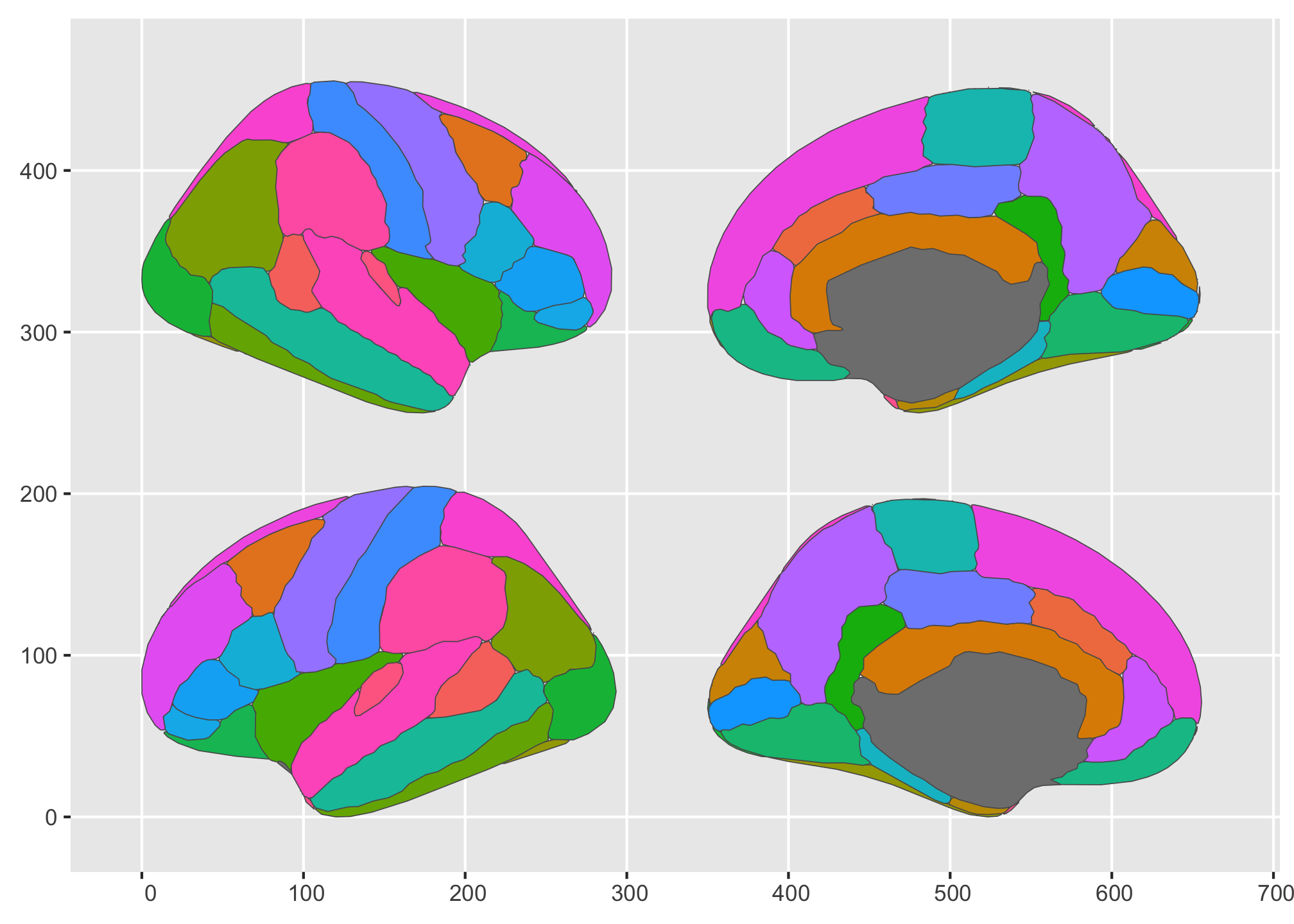
See what’s happened? By using the formula, we could now position the slices so that the hemispheres are in each row, and the lateral/medial side are in the columns. We could easily switch that up, though, so that the sides are in rows and hemisphere in columns
ggplot() +
  geom_brain(
    atlas = dk,
    show.legend = FALSE,
    position = position_brain(side ~ hemi)
  )
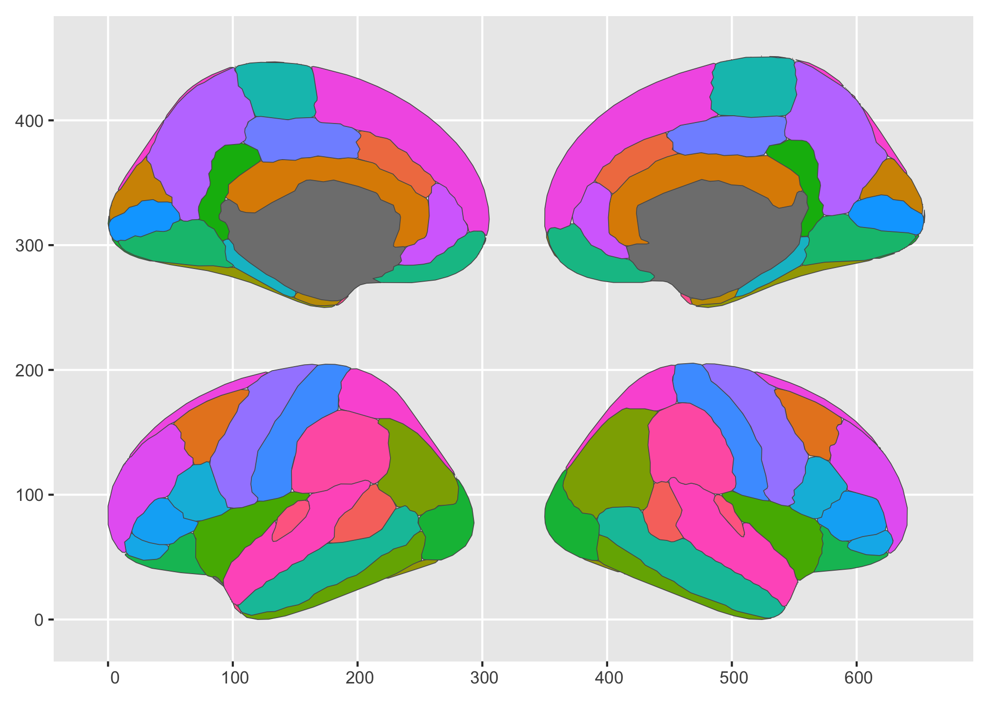
We could even alter their order in the default single row if we wanted.
ggplot() +
  geom_brain(
    atlas = dk,
    show.legend = FALSE,
    position = position_brain(. ~ side  + hemi)
  )
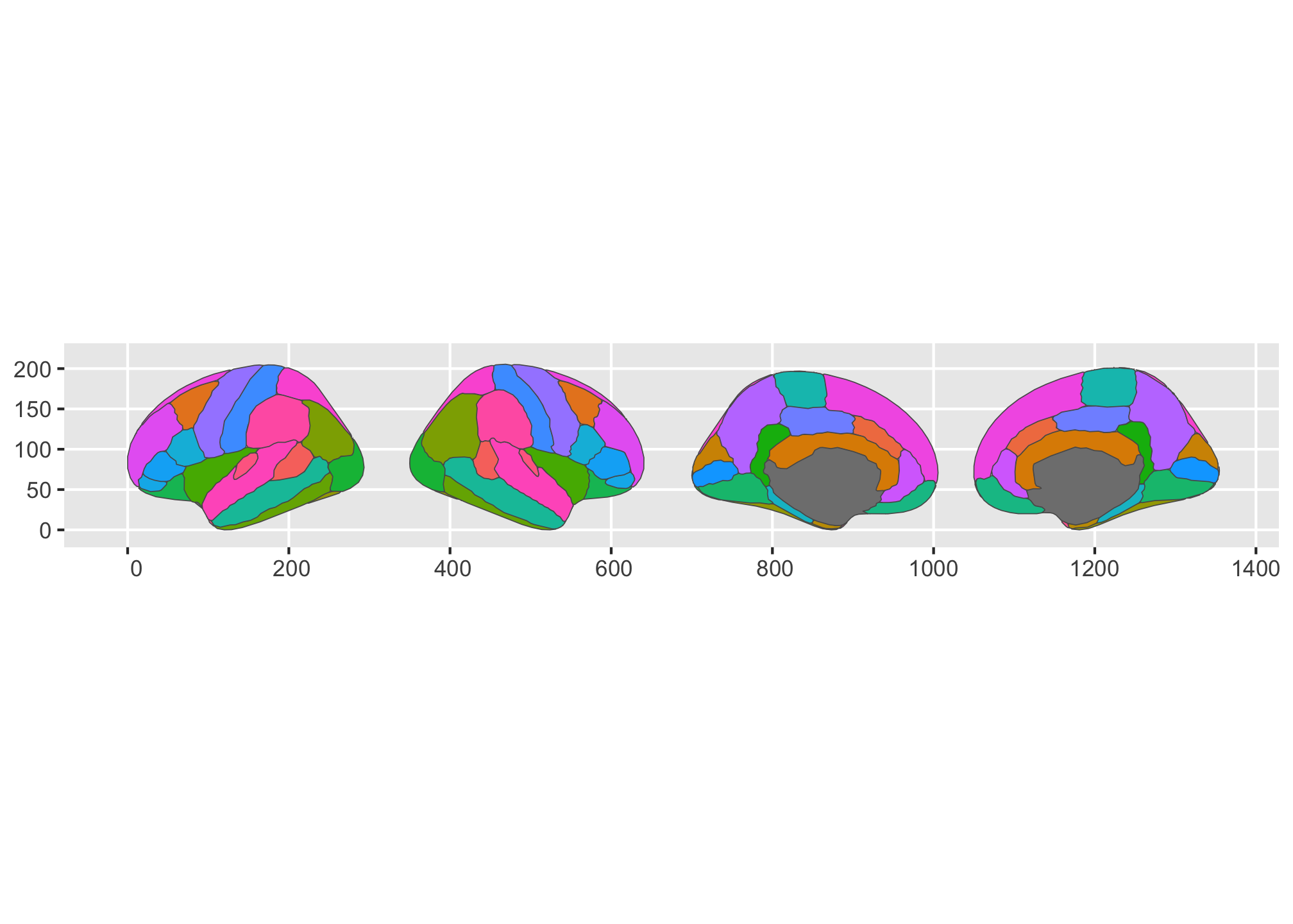
or get them stacked in one single column.
ggplot() +
  geom_brain(
    atlas = dk,
    show.legend = FALSE,
    position = position_brain(side  + hemi ~ .)
  )
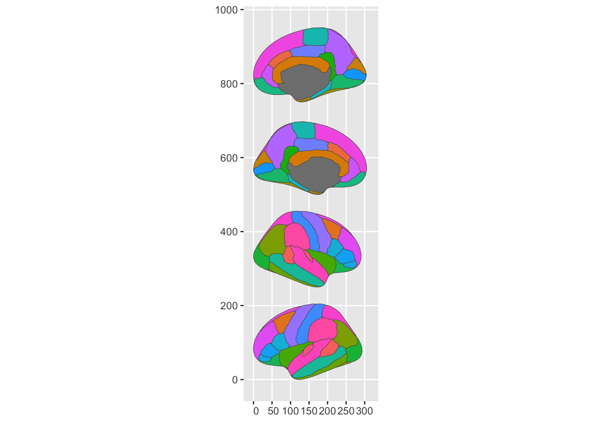
As you can see, the flexibility here is just so much more, so people can get their plots into the shape they are after. I’m pretty happy about that! There are still some limitations to the position altering, but all-in-all there is a lot more you can do now than before.
So do please explore the newer ggseg-package, I believe it’s truly a step up from what we had before. It is also now filled with custom S3 classes for the atlases, meaning you’ll have better print, plot and other methods related to the atlases. These should together give everyone a better experience with the package and all the atlases that are compatible with this plotting system we have created.
plot(dk,
     show.legend = FALSE,
     position = position_brain(hemi ~ side)
     ) +
  theme_brain2()

2021-new-ggseg-with-geom,
author = "Dr. Mowinckel",
title = "New {ggseg} with Geom!",
url = "https://drmowinckels.io/blog/2021/new-ggseg-with-geom/",
year = 2021,
doi = "https://www.doi.org/10.5281/zenodo.13273512",
updated = "Mar 2, 2026"
}